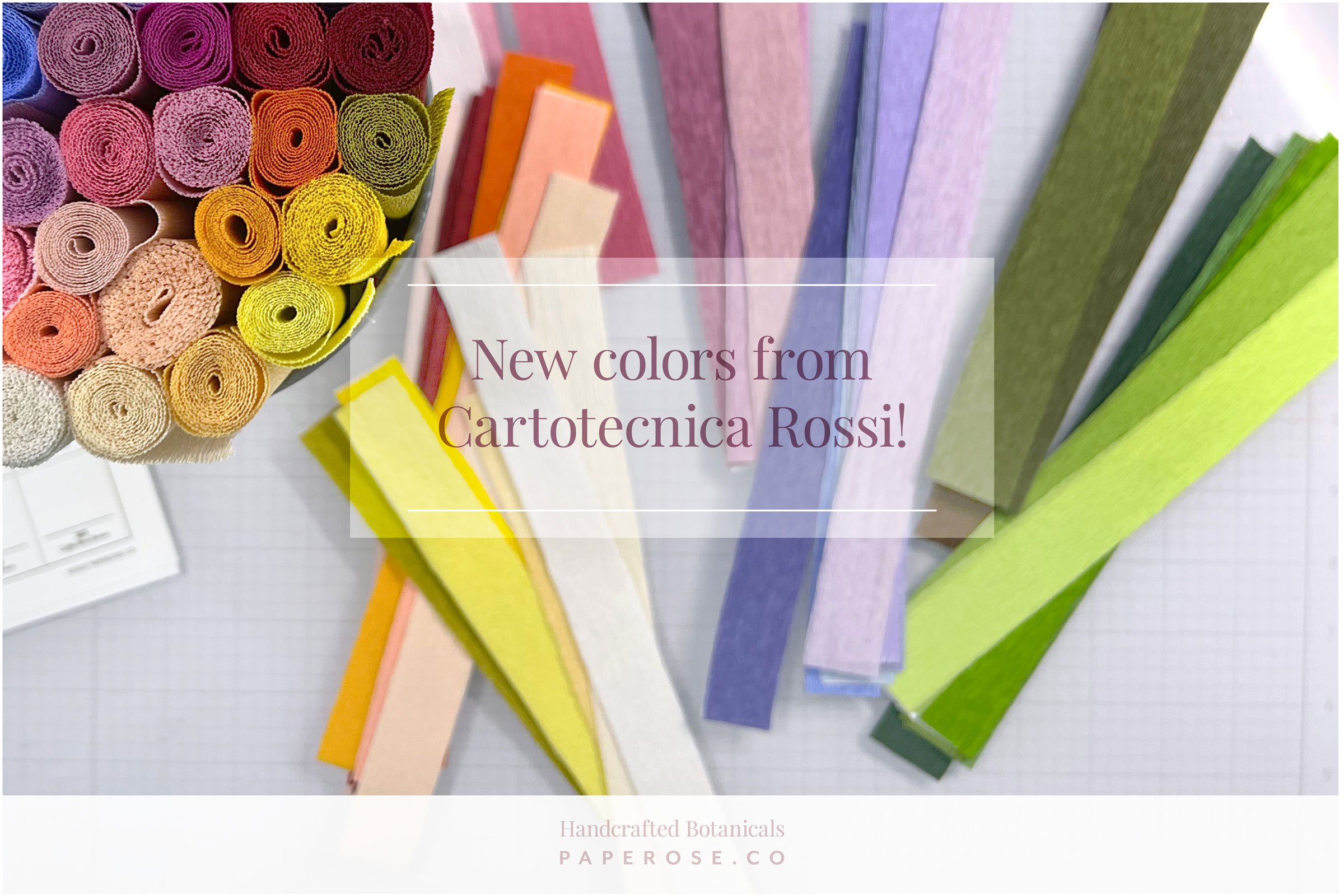
New colors from Cartotecnica Rossi!
Today is an exciting day! For a while, I’ve known about some big news coming from the beautiful paper-makers at Cartotecnica Rossi in Italy. And today is the day I can finally help spread the word—NEW PAPER!!!
For over a decade, I’ve been a loyal fan of Cartotecnica Rossi’s paper, and when they launched their 90g “Artistic” line in 2020, I quickly jumped on board. This paper is lighter, more flexible, and allows me to create more delicate pieces of art. A few new colors have been added to this line since its launch, but as of today, that total is nearly doubling!
I was lucky enough to receive a shipment early, and I’m thrilled to share the full palette with everyone here. It is gorgeous and will be so fun to work with on future projects!
technical notes:
Here is what Cartotecnica Rossi shared with me about this new launch!
Cartotecnica Rossi created the ‘Artistic’ 90g crepe paper (120g/m2) to offer maximum resistance and ductility thanks to extraordinary stretch reaching up to 500%. These characteristics have no equals on the market and is often sought-after by the best artists because it enables them to easily grant extreme softness, lightness, and naturalness to all their creations.
This crepe paper was first launched in 2020 in 24 colors, to which we are now adding 18 new colors. The ‘Artistic’ 90g crepe paper is therefore offered in 42 colours with superior saturation, studied specifically in a range that includes exquisitely nuanced natural tones and brighter ones as well.
Launch Details:
Thursday, September 1
Cartotecnica Rossi will launch their new website, and all the new colors will be for sale. Additionally, they told me that the new site would be more navigable than the previous one, they are adding a blog, and the Artists section will also be completely revamped.
September 1–10
For every purchase made on cartotecnicarossi.it, they will send a limited edition cotton shopping bag as a gift!
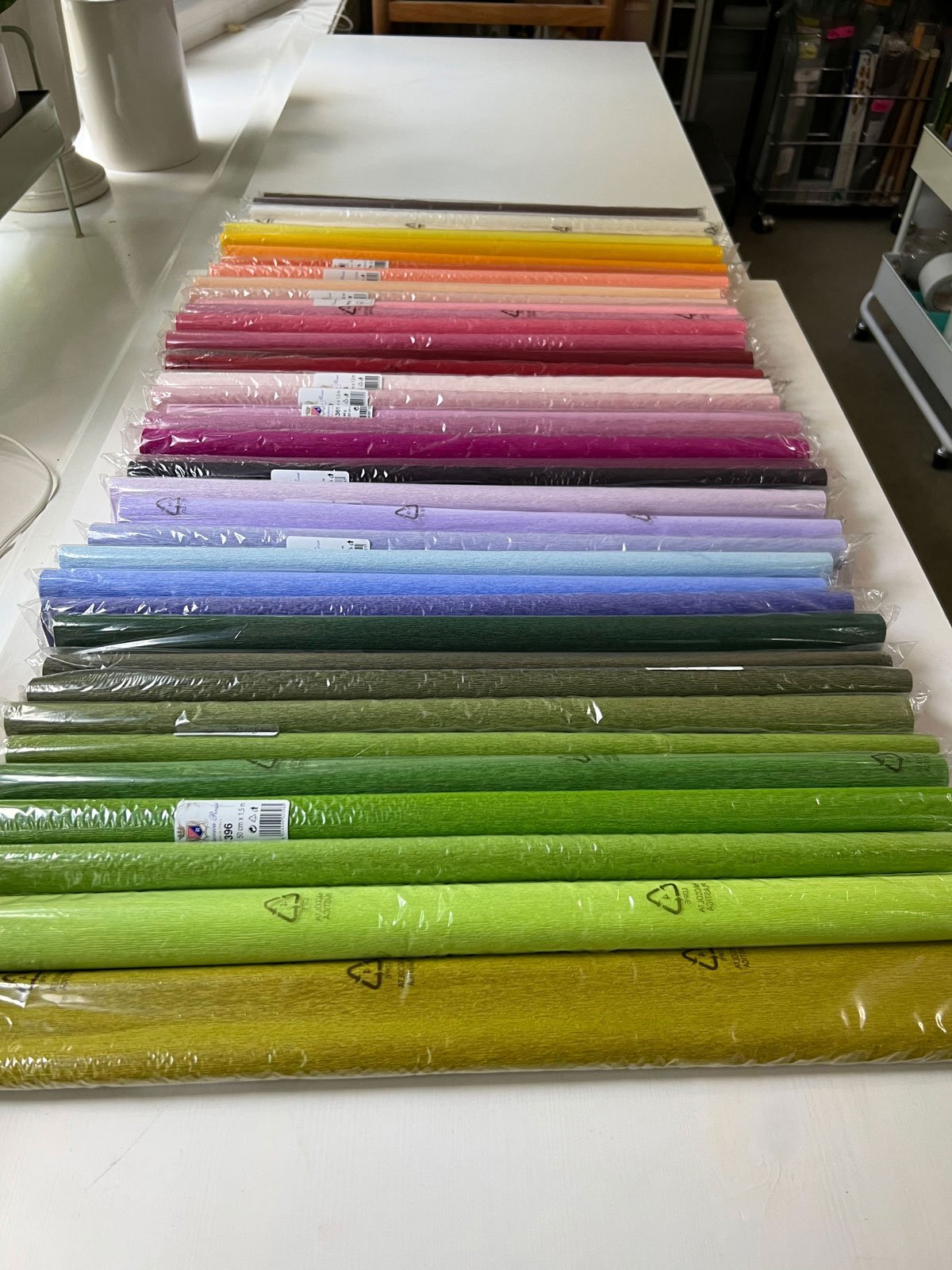
All 42 colors, freshly unboxed in my studio last week!
The Top Five reasons I’m excited about new Colors from Cartotecnica Rossi!
FIVE.
They worked with artists.
12 of the 18 new colors were created in collaboration with Kate Alarcón, who we also know as Cobra Lily. I’ve been a fan of Kate’s work since I first became serious about this craft. She was a regular contributor to Design Sponge (RIP) and was one of the first people who opened my eyes to the possibilities of flower making, along with Tiffanie Turner.
Coincidentally, Tiffanie helped develop several of the original colors in this line of paper. I appreciate that Cartotecnica Rossi trusts artists who use their products the most (and I’ll say best) to advise them on these decisions. I’m especially looking forward to using Kate’s new purple and pink hues—they’re beautiful!
Four.
Easier to color match tones.
Since I specialize in wedding bouquet recreations through my Paperversary service, it’s imperative that I’m able to match the colors I’m shown by my clients. This often involves creating soft spectrums and subtle color shifts to capture more realistic tones. To do this, I typically select a base paper that matches as closely as possible, then work with my long list of paints and other mediums until I get the desired palette.
Not only does this more extensive palette of 42 colors provide more options, but I’m also happy to see that they added tones within their existing palette to help create these harmonious shifts.
Three.
A more extensive lineup eliminates challenges (and thinking!).
In the past two years, I have gradually shifted my methods to rely on my 90g paper lineup, but there are still times when I have to use other weights or types of paper (like doublette) to get the color right for a project. This not only creates subtle shifts in texture, but these papers also handle ink and sometimes glue differently.
I’m looking forward to more consistency and predictability within my projects now that more options are available.
Two.
A more comprehensive range of pinks and greens!
These are two of the most heavily used colors in my studio—green for obvious reasons, and pink may be for more personal ones. Ha. Either way, I’m psyched to have more tones. The new pinks (and pinkish purples) are still on the softer side but are very realistic and lovely. (FYI: I’d love to see a few more colors added in the red/magenta/fuchsia spectrum if anyone wants my vote!)
As for the greens, we now have a range of 9 (or 10 if you want to count the new Cat’s Eye Green which is a bit of a shifter between gold and green). This will be so helpful for adding depth to foliage and making more natural plants. I cannot wait to dig into these!
One.
More inspiration!
Who am I kidding? The number one reason I’m so happy to have new paper is because it’s new paper! New colors take a long time to develop and don’t come around very often. Getting 18 new colors at once is beyond thrilling. I haven’t had them in my hands for long, but I’m already brewing ideas for what I want to make, and what new palettes I want to try out first.
I’m so grateful to Cartotecnica Rossi for including me in this launch, and for continuing to inspire other artists and me to create with their gorgeous paper.
Full list of Colors!
(And a free swatch chart to download!)
Below is the complete list of colors, noting the new colors and those created in collaboration with Kate and Tiffanie.
Since I’m a visual person (duh), I also created a swatch chart to help keep track of the colors I use on projects, and what rolls I need to reorder. I also prefer to organize all of my colors by family, so that’s how I have everything arranged.
If you think it will help you, I’m adding a PDF here (click on the image) for you to download and use too! Just cut out and tape or glue down your own swatches as you add to your 90g collection.
I am hard at work on custom orders for a bit longer, but I can guarantee you will see these new colors heavily featured in my next collection. (Stay tuned or sign up to be notified for that launch.) In the meantime, here are some shots I took this weekend while I played with colors. All forty-two!


